Discovering Chinese Pro
An interactive Chinese learning platform that helps teachers deliver lessons, assign practice, and track progress across classroom and at-home learning.

My Role
Sole Product Designer
Team
1 x Visual Designer
2 x Software Engineers
Year
2018
My Contribution
Product Strategy
User Research
Product Design
Project Management
IMPACT
Redesigned the teacher experience for one of the best-selling Chinese learning platforms in the U.S. — contributing to 15% year-over-year sales growth.
Before
After

DESIGN CHALLENGE
As the company’s second-largest revenue driver, DCP became a business priority. My challenge was to uncover what was driving the decline and shape a redesign strategy to restore growth.
DISCOVERY
Identifying where to start
Before investing in deeper research, I needed a point of view on what was worth investigating. I started with a product audit and backlog review, which surfaced three recurring themes:
One experience, two different needs
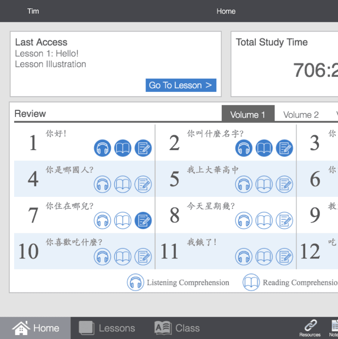
The home page was meant to track students, but instead tracked teachers' progress.
A fragmented & inefficient assignment flow
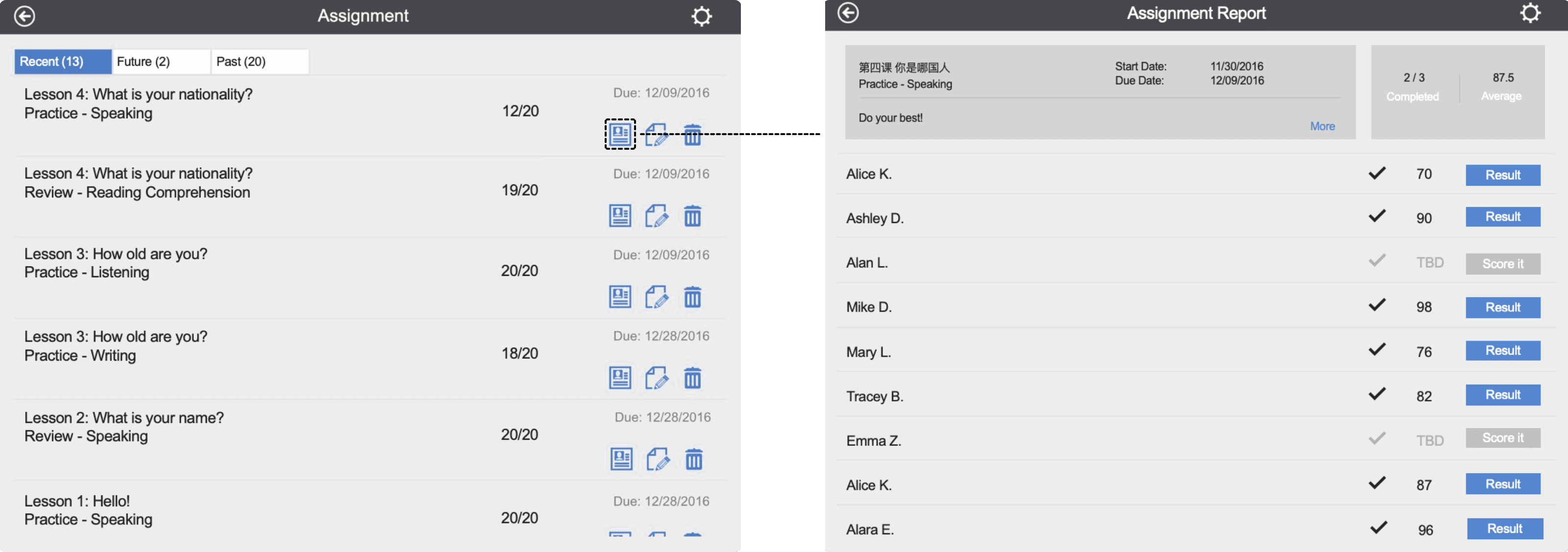
The most-used assignment workflow generated more complaints than any other.
Outdated & inconsistent design language
Designed in 2012, DCP no longer met expectations for a modern visual system.
USER INTERVIEWS
Finding what was behind the problems
To understand the root causes behind the three recurring themes, I interviewed 14 teachers across three carefully selected groups, each chosen to answer a different research question:
5 teachers from backlog
to understand reasons behind existing requests & complaints
6 most frequent users
to uncover friction in the daily teaching workflow
3 prospective subscribers
to understand the needs most critical to sales growth


Collecting teacher feedback at ACTFL, a major foreign-language education conference.
KEY FINDINGS
A tracker for activity, not progress
Six concrete struggles emerged, which I grouped into two categories:
Teachers couldn't see the right picture:

1
Limited data coverage
Only captured students' self-practice, while most students completed assigned exercises.
2
Binary progress status
Only showed completed and incomplete statuses, giving teachers little insight into actual student performance.
4
Incomplete exercise coverage
Only tracked objective exercises while excluding open-ended work, and covered just one of the workbook’s two exercise sections.
3
Unhelpful study time
Total study time accumulated from day one until the number became too large to interpret.
Teachers couldn't act efficiently:
Inefficient assignment workflow
Assigning homework took at least five steps per lesson (flow A), and checking submissions took at least four more (flow B).
5

Scattered student progress data
Progress data was organized by assignment instead of by student, making individual progress hard to gauge.
6
DESIGN PRINCIPLES
Defining the target experience
Guided by the research findings and business goal, the CEO and I defined four principles to shape the product’s look, feel, and behavior.
Lively
lighthearted and motivating look & feel
Unobtrusive
Easy transition from old experience
Informative
Clear and meaningful student data
Empowering
Powerful and efficient tool for teachers
A Streamlined Assignment and Progress Tracking System
Helping teachers manage assignments easily and understand student progress at a glance


DESIGN
From scattered data to teacher control
I redesigned the system end to end around three directions that addressed the research findings:
Expand coverage — give teachers the full picture
Expanded the progress section from 3 review exercises to 15, covering both Review and Practice sessions across nearly the entire workbook. Short exercise labels, such as L for Listening and S for Speaking, helped teachers scan the progress section quickly.:
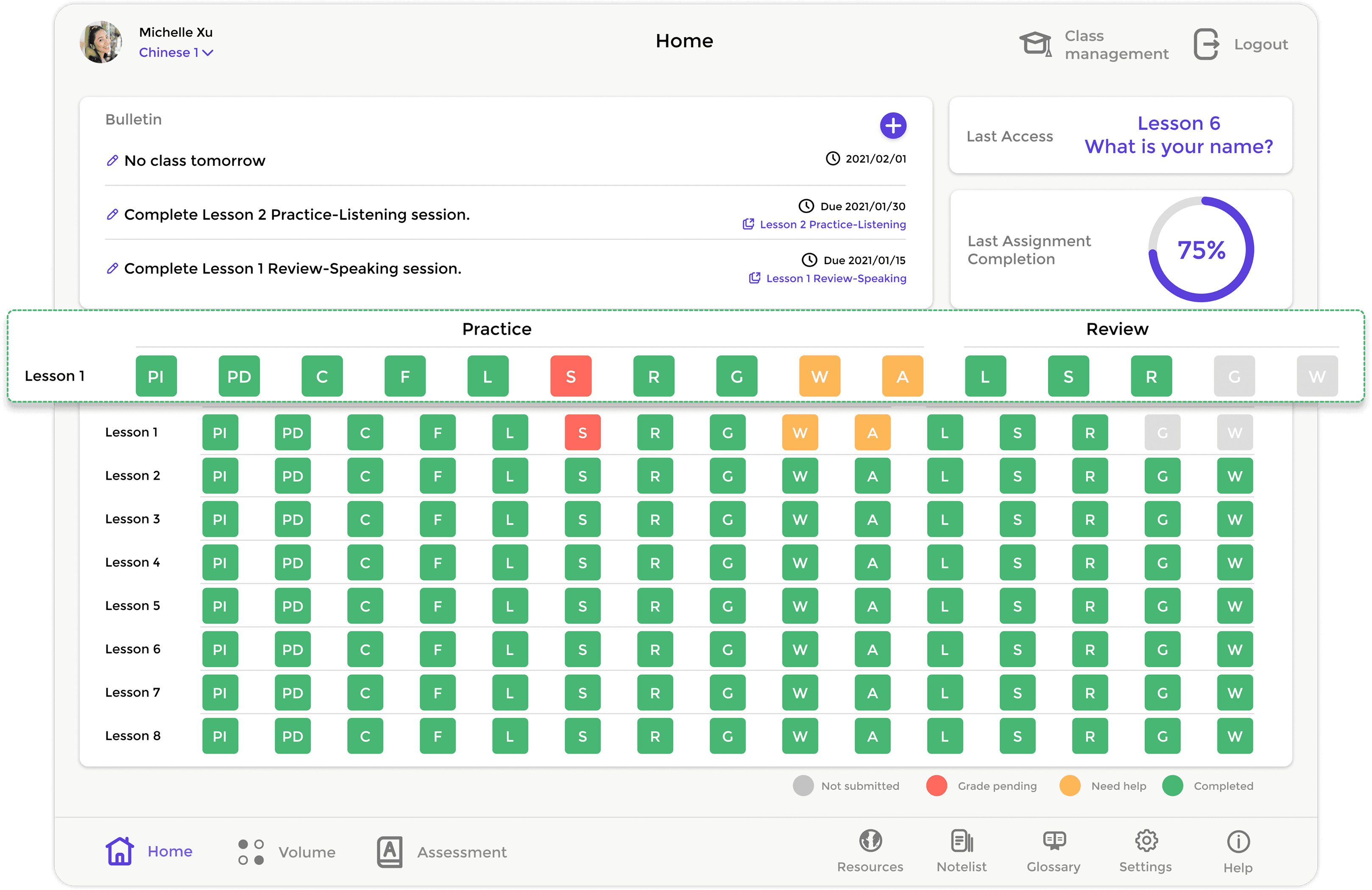
Surfaced assignment data that was never on the home page before. By combining self-practice and assignment data, the platform gave teachers a fuller picture of student performance:


S
Make progress meaningful at a glance
Took exercise status from 2 to 4: keeping completed/uncompleted, adding grade pending, and introducing a "need help" status for any exercise scoring below 60 — helping teachers quickly identify students who needed support:

Designed individual-student and whole-class views, helping teachers track one learner or the full classroom depending on their tasks.
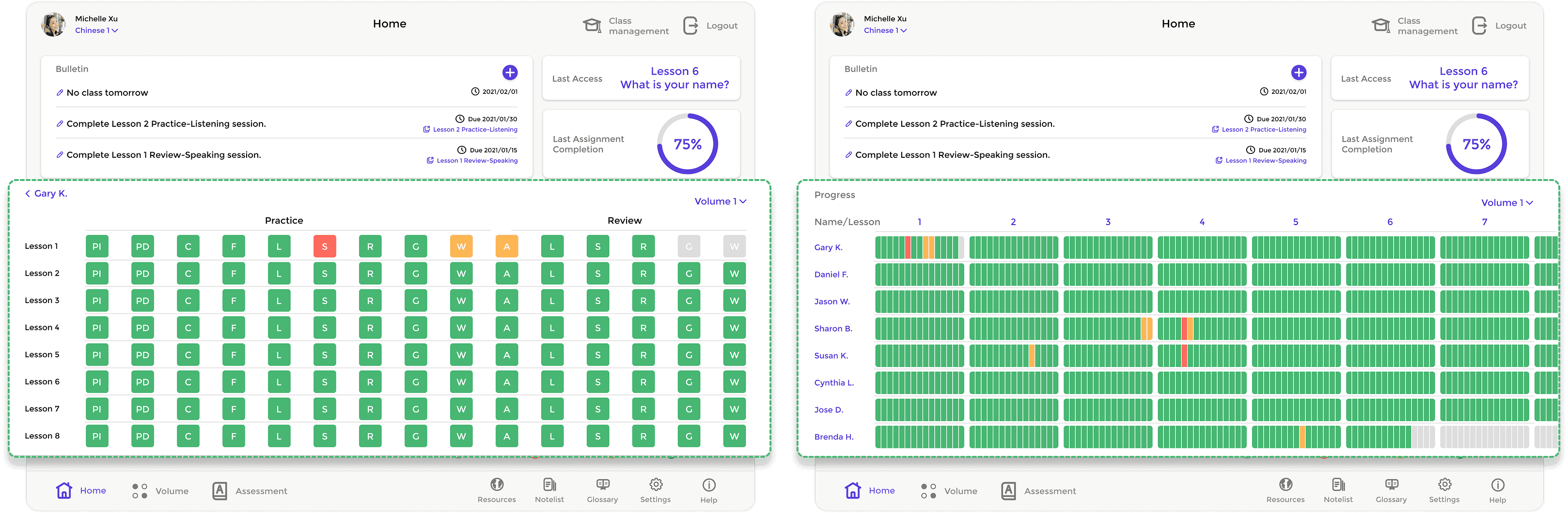
Individual student view
Whole class view
Streamline daily teacher workflows
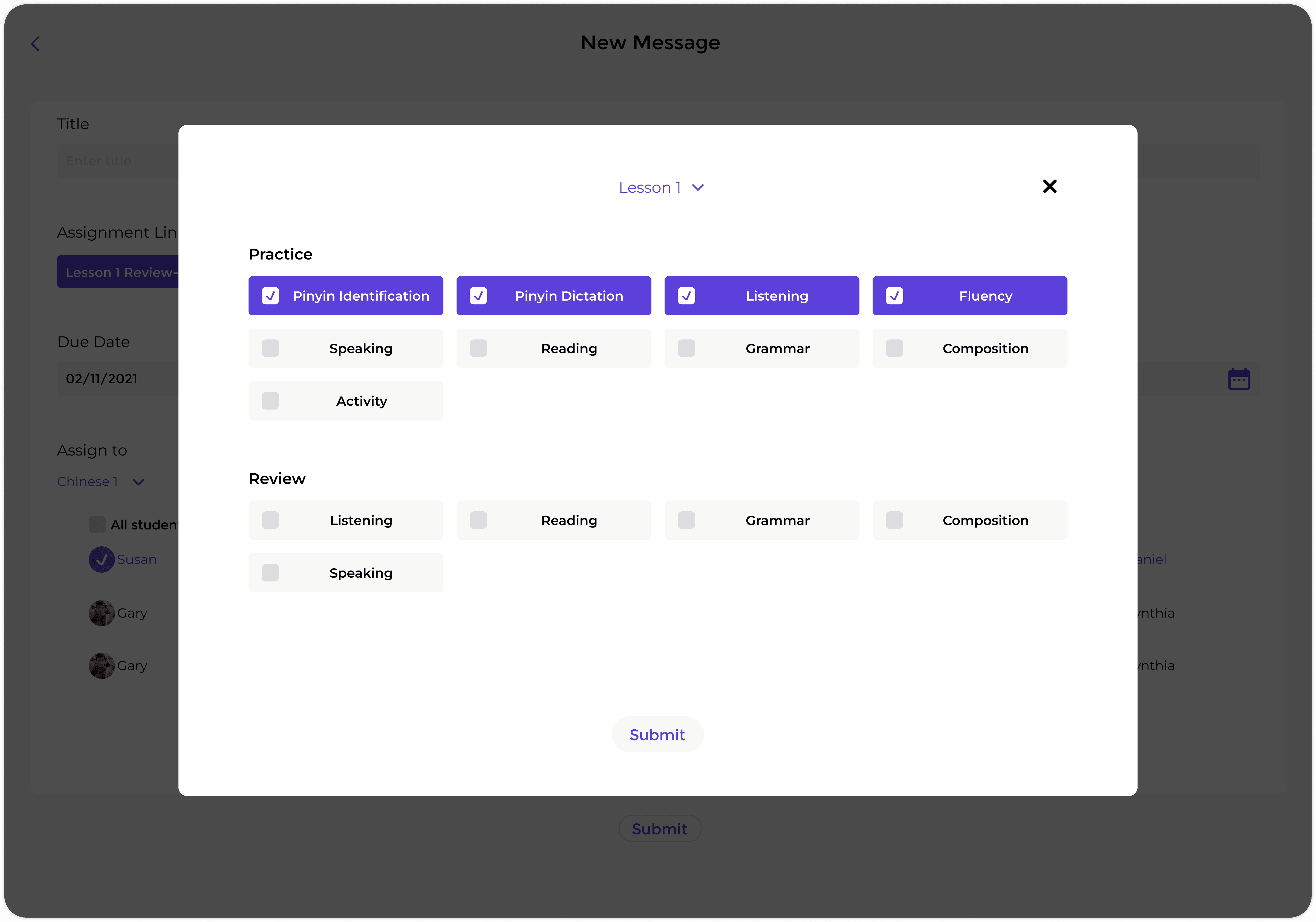
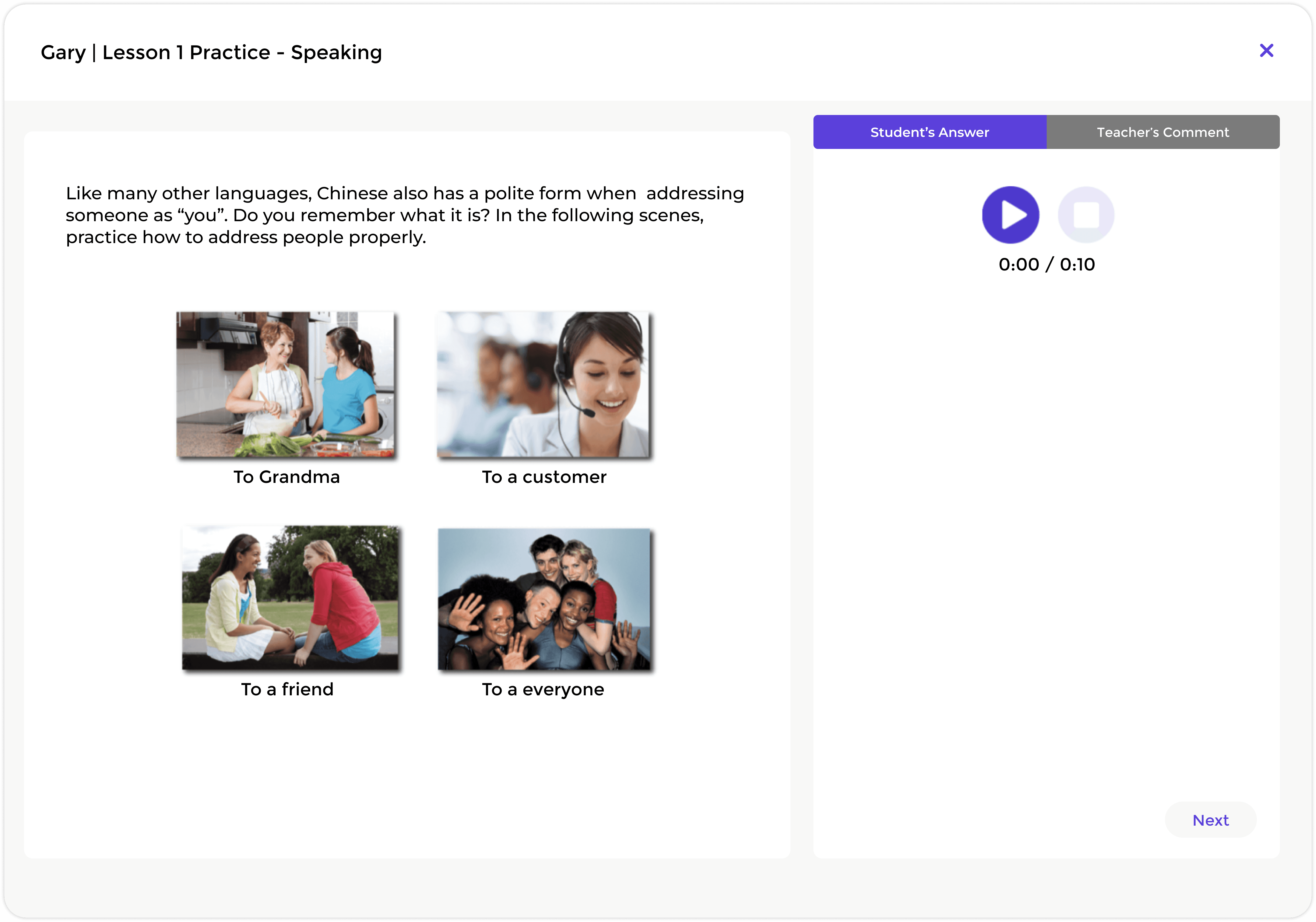
Simplified the homework assigning and checking flow by creating a bulletin board that brought all assignment-related information into one place. Teachers could now assign homework with one tap instead of going through five pages, and check student submissions with one tap instead of four.

VISUAL GUIDE
A design system for consistency
Because outdated and inconsistent design language was a major issue, I created a lightweight design system for the redesign, including type scale, color, buttons, and icons. This helped the new experience feel cohesive and made it easier to extend over time.

IMPACT
15% year-over-year sales growth
The redesigned system contributed to 15% year-over-year sales growth and received positive feedback from teachers:
"The new homepage is a great addition and makes my job easier."

Connie Ngu
Cambridge Christian School, Florida
"My students and I really like the new look and features."

Yi D. Oliff
St. Catherine's School, Virginia
"Thanks so much! The student management system saves me a lot of time."

Yan Liang
Washington International School, D.C.
"I've been using DCP for four years. These new features make teaching and learning much more effective!"

Shirley Li
San Domenico School, California
WHAT'S NEXT
Toward a more inclusive learning experience
The redesign focused first on teachers because they drove product adoption. If I continued the work, I would expand it in two areas.
Make progress accessible beyond color
The progress section relies heavily on color to communicate status. I would add icons, labels, or patterns so color-blind users can understand progress without relying on color alone.
Design for the full learning loop
The redesign improved how teachers assign, check, and track work. Next, I would improve the student experience by helping learners understand assignments, track their own progress, and stay motivated.